Week 10: Introduction to Manga
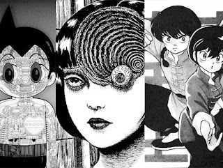
Reading an earlier manga like Astro Boy (1952) is interesting because there are so many similarities between it and western comics. It's a well-known fact that Tezuka was heavily influenced by Disney and it really shows. His character designs share many traits with Disney cartoons and comics, such as their exaggerated and rounded features. They tend to have over the top expressions and shorter/fatter characters tend to stand bow-legged. Nowhere is the influence more apparent than in the way Tezuka draws eyes. A lot of the time, especially in earlier stories, the characters' eyes look like they were drawn by Walt Disney himself.
In addition to the Disney influence, Astro Boy tends to have a lot more panels per page than later manga. It makes reading it feel more like reading an American comic from the time at points. However, there are some mainstays of manga that we see pop up here. For example, the use of many parallel thin lines to show motion is here. While this also appeared in western comics, in manga (and/or manga-inspired works) there tend to be many more lines, sometimes replacing the background entirely. When there are backgrounds, they are far more detailed than they would be in an American comic with similarly cartoony characters.
Ranma 1/2, while a later manga (1987), still has a lot of similarities to Astro Boy when it comes to the art. Rumiko also has characters with a lot of round features, like big eyes and pudgy limbs, but they have more realistic proportions. This style almost feels like an evolution from Tezuka. After decades of different artists taking inspiration from him and those who came after him, we get styles similar to this. Ranma 1/2 also features more detailed backgrounds, although they are sometimes omitted to not distract from the action or replaced with patterns that help convey the mood of the panel. We also see fewer panels per page on average here. Even when a page does have more than five panels, they tend to be more open than in Astro Boy, which tends to fill each panel with detail. Of course, Astro Boy and Ranma 1/2 are trying to accomplish very different things. The former is mainly an action manga, so each panel is filled with action or excitement, while the latter is a romantic comedy, so not every panel needs to be as captivating.
Reading Uzumaki alongside the previous two manga was quite an experience. Astro Boy and Ranma 1/2 are much more light-hearted manga (although Tezuka does explore some heady science fiction ideas), especially compared to Ito's dark and disturbing work. Ito's style is completely different from Tezuka's and Rumiko's; he draws very detailed and realistic people in a very detailed and realistic world. This helps make the horror more effective as it feels more real than it would in a cartoony style. Granted, horror can work in a cartoony style, but Uzumaki is a very psychological work that is punctuated by disturbing images. And dear God are these images disturbing (aside from the chapter about the spiral hair). When reading the premise of the manga, you may not expect it to be as chilling as it is. After all, how scary can spirals really be? You start regretting that question when you see a man who stuffed himself in a small wooden bath, his body contorted and broken into a spiral. We are spared absolutely no detail, seeing every fold and twist lovingly rendered by Junji Ito's pen.
Something especially impressive is how Ito portrays motion. With such realistic figures, it could be easy for them to come off as stiff. However, Ito still makes every character expressive, especially when we see them reacting to something horrifying. On one page, we are shown a character moving each eye individually. It's genuinely unnerving, and the fact that this action is conveyed through still images is insane.
Comparing and contrasting these three manga has been an interesting experience. They are all such disparate works, coming from different eras and attempting different things, but there are still similarities to be seen. The biggest thing they all have in common is detailed backgrounds (at least when they're drawn). Manga artists tend to do this, no matter how stylized their characters are. Also, they're all in black and white. In America, mainstream comics tend to be printed in color, but this isn't always the case with manga. This means each artist has to show all the details through lines or shadow. I feel like manga as a whole, more so than western comics, relies so much more on lines and shadow. We take that for granted here in the US, where we have artists like Alex Ross and other painters who want to move away from lines. When I see things like that celebrated, it almost feels like the industry is trying to distance itself from the medium's origins (not that painterly styles aren't a valid approach to comics). Meanwhile, in Japan, manga artists continue to embrace the traditions and origins or the medium while still innovating.


Comments
Post a Comment