Posts

Showing posts from October, 2019

Week 10: Introduction to Manga

Image
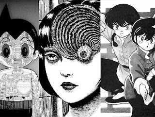
  This week I read some Astro Boy by Osamu Tezuka, the first six chapters of Uzumaki by Junji Ito, and the first volume of Ranma 1/2 by Takahashi Rumiko. I've read some manga before, but not much, so I wanted to get a diverse selection of classics to expand my palate. Reading an earlier manga like Astro Boy (1952) is interesting because there are so many similarities between it and western comics. It's a well-known fact that Tezuka was heavily influenced by Disney and it really shows. His character designs share many traits with Disney cartoons and comics, such as their exaggerated and rounded features. They tend to have over the top expressions and shorter/fatter characters tend to stand bow-legged. Nowhere is the influence more apparent than in the way Tezuka draws eyes. A lot of the time, especially in earlier stories, the characters' eyes look like they were drawn by Walt Disney himself. In addition to the Disney influence, Astro Boy tends to have a lot more

Week 9- Cartoonist's Track: European Comics

Image
For this page, I was influenced by Moebius's work in The Incal . Specifically, the page early on where John Difool is falling down suicide alley. It's a gorgeous page with fascinating architecture and a great perspective. I decided to warp my perspective for a unique look. I integrated Moebius's use of thin lines and attention to detail into my page. The focus character of the page is also heavily inspired by John Difool's design.

Week 8- Cartoonist's Track: Representation

Image
In this specific case, I went for likenesses more than showing ethnicity. Obviously, this is an autobiographical piece, so I am biased towards seeing these people's individual traits more than their ethnic traits. I was more interested in capturing each person's energy and personality. Also, in this specific case, I am portraying a white man and two people who are mixed with white, so they are going to share some common features.

Week 7- Maus

Image
Art Spiegelman’s approach to telling his father’s story in Maus is fascinating. On paper, his decision to represent everyone with cartoon animals sounds terrible. In lesser hands, it could’ve turned the story into a farce, and yet it works wonders. Part of what makes it work is that the characters aren’t that cartoonish. Aside from their animal heads, the characters have realistic proportions and inhabit a realistic world. It all ties back to the idea of the icon and how it can make a reader empathize with a character easier. Also, it works as a perfect shorthand to show someone’s nationality/religion/affiliation without having to explain their full backstory. Spiegelman plays with this throughout the comic too. For example, in one scene where Vladek is pretending to be Polish, he is wearing a pig mask. Spiegelman also addresses the process of assigning everyone an animal when he is deciding what animal he should draw his wife as. Since she i

Week 6- Underground Comix Cartoonist's Track

Image
The main aspects of Robert Crumb's cartooning that I emulated were his layouts and his use of hatching. Crumb's art makes extensive use of hatching and cross hatching, and I used some in this comic. Also, his layouts are usually simple and grid-like, sometimes using many panels per page. Therefore, aside from the first and final panels, I used many equally sized panels side by side.  As far as the content itself, I wanted to parody a lot of Male cartoonists' attitude toward women and minorities, so I did a very unsubtle parody. I wanted to emulate the crass nature of the movement while criticizing certain aspects of it.